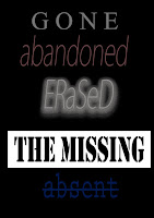
 We made a list of potential names for our thriller. These names listed sound vague but link to the synopsis of our trailer. From this range of names we thought that 'The Missing' and 'Left Behind' were most suited to the thriller genre as they are ominous and vague so they will intrigue our audience.
We have decided on the title 'Left Behind' because 'The Missing' could be mistaken to be a TV documentary. 'Left Behind' sounds more suited to the psychological thriller genre.
We experimented with which title would look best by typing them out and editing them on Photoshop. This meant changing the font, colours, and adding different effects to them. The connotations associated with these titles are very ominous and mysterious as the colours we used were grey, neutral red, dark blue, and black. We decided that Left Behind looked best in a handwriting font called 'Biro' on PowerPoint because it is creepy and makes the audience ask lots of questions as they are intrigued to why the font looks so personal. 'Left Behind' has negative connotations. Also, the two words connote neglect and isolation which links to our narrative because our locations are abandoned so they're isolated.


No comments:
Post a Comment